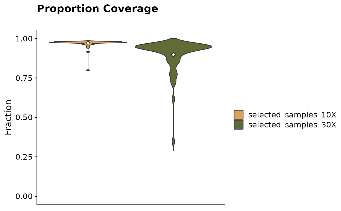
Proportional Coverage Plot.
fancy_propcov_plot.RdVisualize proportional coverage (10X and 30X) for selected samples and add comparison group (optional).
fancy_propcov_plot(
  these_sample_ids,
  metadata,
  these_samples_metadata,
  keep_cohort,
  keep_pathology,
  comparison_samples,
  seq_type = "genome",
  plot_subtitle = ""
)
Arguments
- these_sample_ids
Data frame with sample IDs (to be plotted) in the first column.
- metadata
Optional, user can provide a metadata df to subset sample IDs from.
- these_samples_metadata
GAMBL metadata subset to the cases you want to process.
- keep_cohort
Optional parameter to be used when these_sample is NULL. Calls get_gambl_metadata() and filters on the cohort supplied in this parameter.
- keep_pathology
Optional parameter to be used when these_sample is NULL. Calls get_gambl_metadata() and filters on the pathology supplied in this parameter.
- comparison_samples
Optional parameter, give the function a vector of sample IDs to be compared against the main plotting group.
- seq_type
Selected seq type for incoming QC metrics.
- plot_subtitle
Plotting parameter, subtitle of generated plot.
Value
A plot as a ggplot object (grob).
Details
Create a highly customizable plot visualizing proportional alignment metrics i.e what proportions of the aligned reads that show 10x and 30x coverage.
This function provides straightforward subsetting parameters allowing for a straightforward execution. Either provide a data frame with sample IDs in the first column to the these_samples_ids parameter.
Or, call one of the optional parameters for using an already subset metadata table (subset to the sample IDs of interest).
If these_samples_ids and these_samples_metadata is not provided, the user can subset al GAMBL samples on the fly with keep_cohort and/or keep_pathology.
This function can also plot the same results for a comparison group of interest, i.e another table with sample IDs. This can be useful for visualising how certain cohorts/pathologies compares to each other.
To do this one would call the function with comparison_samples parameter. For more info on how to use this function, please refer to examples, vignettes (fancy_vignette) and parameter descriptions.
Examples
#Example 1 - using these_sample_ids parameter
#subset on FL cases with QC metrics available and plot
metadata = get_gambl_metadata()
kridel_fl = dplyr::filter(metadata, pathology == "FL",
               cohort == "FL_Kridel")
kridel_fl_samples = dplyr::select(kridel_fl, sample_id)

fancy_propcov_plot(these_sample_ids = kridel_fl_samples)
#> /projects/nhl_meta_analysis_scratch/gambl/results_local/shared/gambl_genome_results.tsv
#> QC Metric successfully retreived for 56 samples out of a total of 56 samples in input sample table.
#> Warning: The `fun.y` argument of `stat_summary()` is deprecated as of ggplot2 3.3.0.
#> ℹ Please use the `fun` argument instead.
#> ℹ The deprecated feature was likely used in the GAMBLR package.
#>   Please report the issue to the authors.
#> Warning: Removed 20 rows containing missing values (`geom_violin()`).


#Example 2 - using already filtered metadata (these_samples_metadata)
fancy_propcov_plot(these_samples_metadata = kridel_fl)
#> /projects/nhl_meta_analysis_scratch/gambl/results_local/shared/gambl_genome_results.tsv
#> QC Metric successfully retreived for 56 samples out of a total of 56 samples in input sample table.
#> Warning: Removed 20 rows containing missing values (`geom_violin()`).


#Example 3 - using in-house metadata filtering options
fancy_propcov_plot(keep_cohort = "FL_Kridel",
                   keep_pathology = "FL")
#> /projects/nhl_meta_analysis_scratch/gambl/results_local/shared/gambl_genome_results.tsv
#> QC Metric successfully retreived for 56 samples out of a total of 56 samples in input sample table.
#> Warning: Removed 20 rows containing missing values (`geom_violin()`).
